Preface
The bedroom serves as a private sanctuary—a place to shed the day’s fatigue and find emotional repose—and stands as the most restorative spiritual haven within our daily lives. Color, acting as the primary vehicle for a space’s emotional tone, directly influences an occupant’s sleep quality, state of mind, and overall living experience.
A gentle color palette can soothe the clamor of the day, while a harmonious color scheme fosters an atmosphere of tranquility. When chosen thoughtfully, colors can not only align with one’s personal aesthetic and lifestyle habits but also ensure the bedroom embodies a perfect balance of comfort, functionality, and aesthetic appeal.
How to scientifically coordinate bedroom colors, how to use color tones to balance light, shadow, and spatial perception, and how to craft a personal sanctuary for rest—these are questions that concern every home creator.
Drawing inspiration from the EClife website, this article explores the logic of color, design principles, and practical techniques to unlock the secrets of effective bedroom color design—ensuring that every shade contributes to a life of comfort and well-being.
Design Scheme and Philosophy
1.The Underlying Logic of Bedroom Color Design
Cool Color Palette (Blue, Green, Light Gray): Calms the nervous system and lowers heart rate; helps alleviate stress and improve sleep quality, making it a mainstream and safe choice for bedrooms.
Warm Color Palette (Beige, Apricot, Light Brown, Soft Pink): Creates a cozy, enveloping atmosphere; ideal for bedrooms with poor lighting or a naturally cool ambiance, fostering a sense of belonging and tranquility.
High-Saturation Colors (Red, Orange, Bright Yellow): Prone to stimulating excitement and restlessness; using them over large areas can disrupt sleep, so they are best reserved for small accents or decorative touches.
Well-Lit Spaces: Opt for low-saturation cool tones or neutral colors to prevent the hues from appearing overly harsh or glaring under strong natural light.
Poorly Lit Spaces: Prioritize light warm tones and high-luminosity colors to brighten the room and prevent dark colors from making the space feel oppressive.
Small Spaces: Predominantly use light color palettes to leverage the visual expansive effect of color and make the room appear larger; in larger spaces, dark colors may be incorporated judiciously to add depth, layering, and a sense of stability.
2.Core Principles of Bedroom Color Schemes
The classic “60-30-10 Rule” applies to all bedroom styles: 60% represents the dominant color (walls/large surfaces); 30% represents the secondary color (bedding/curtains); and 10% represents the accent color (throw pillows/decorations).
Ideally, you should select a color palette consisting of variations within the same hue—differing only in lightness and saturation—such as light gray + medium gray + dark gray, or creamy white + oatmeal + light beige. This approach creates visual unity and softness, fostering a sophisticated and tranquil atmosphere that is perfectly suited for minimalist, natural wood, or “creamy-style” bedrooms.
Use small doses of contrasting colors to add brightness. Combinations such as blue and orange, or red and green, possess strong visual impact; however, in the bedroom, they should be limited strictly to the 10% accent category. Avoid using large areas of clashing colors on walls or furniture, as this can easily disrupt the restful ambiance and lead to visual fatigue.
3.Practical Tips for Bedroom Color Design
For walls, it is recommended to select Morandi tones, soft pastel shades, or neutral gray hues. Avoid highly saturated solid colors; these softer tones are visually enduring, less likely to go out of style, and compatible with a wide variety of furniture styles.
For bedroom ceilings, consistently opt for white or extremely light shades; this visually elevates the ceiling height and helps alleviate any sense of confinement.
If you wish to incorporate darker elements, adhere to the principle of keeping walls light while floors and furniture remain dark. For instance, pairing light gray walls with a dark walnut bed anchors the visual weight of the space, creating a sense of stability and comfort while avoiding a “top-heavy” imbalance.
Monochromatic bedrooms can easily appear bland; to add depth and visual interest, introduce textural contrasts using materials such as wood, cotton and linen fabrics, leather, and metal. Even with a simple color palette, this interplay of textures can create a sophisticated, high-end aesthetic.
Warm yellow lighting complements bedrooms featuring warm color palettes, whereas neutral lighting is best suited for spaces with cool or neutral color schemes, as it prevents color distortion.
Recommended Themes
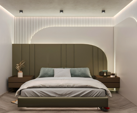
This is a modern Bohemian-style bedroom, hand-picked by our editors from the EClife website.
The entire space is dominated by soft whites and light grays, accented by low-saturation pops of color. This approach avoids any sense of visual heaviness, enhancing the room’s airiness and openness—making it an ideal choice for small to medium-sized apartments. Furthermore, this light-toned palette is highly receptive to natural light; even in bedrooms with average lighting conditions, it ensures the space remains bright and luminous, effectively banishing any hint of gloom or drabness.
The feature wall is painted in a low-saturation “Morandi” gray-green, while the surrounding walls, bedding, and soft furnishings blend shades of creamy white, light gray, and milky apricot. These warm neutral tones harmonize beautifully to create a cozy and inviting atmosphere, instilling a strong sense of belonging for the occupant.
Deep brown nightstands paired with olive-green accents create a complementary interplay between “warm brown” and “cool green.” When applied in small doses, this combination effectively balances cool and warm tones, infusing the space with warmth without overpowering the room or disrupting its overall aesthetic harmony. The result is a sophisticated and high-end visual appeal.
With its pure white ceiling, soft white walls accented by deep green details, light-colored wood flooring, and deep brown furniture, this design strictly adheres to the “lighter above, darker below” color principle. This technique visually lowers the room’s center of gravity, creating a sense of stability and groundedness.
Warm-toned recessed spotlights and linear ambient lighting cast a gentle glow that softens the cool olive-green accents, enhances the coziness of the creamy white bedding, and further reinforces the bedroom’s overall relaxing atmosphere.
In summary, this color scheme possesses remarkable versatility—it works perfectly for residents of any age group and fits seamlessly into any apartment layout. This timeless palette eschews eccentric or faddish design elements, ensuring that residents never suffer from “aesthetic fatigue”; it stands as a truly enduring and visually pleasing choice for long-term living.
Summary
Bedroom color design must be grounded in the fundamental objective of promoting sleep and relaxation. Priority should be given to low-saturation cool tones and warm neutral shades to establish a tranquil foundation. These tones should be further refined based on the room’s natural lighting, layout dimensions, and the specific needs of the occupant, while strictly avoiding the extensive use of high-saturation, bright colors.
In terms of color scheme, strictly adhere to the “60-30-10” golden ratio, utilizing monochromatic and analogous colors to create harmonious visual layers. Uphold the spatial principle of “lighter above, darker below,” and skillfully employ negative space to enhance the room’s sense of openness and breathability.
Darker tones should be focused on specific focal points—such as the headboard area—to add textural richness through the interplay of diverse materials. Complement this with appropriate warm or neutral lighting to further enhance the overall ambiance. The ultimate goal is to achieve a perfect synthesis of aesthetic appeal, practical functionality, and long-term livability, thereby crafting a private sanctuary that exudes both a sense of healing tranquility and sophisticated elegance.
For more design inspiration, we invite you to visit the EClife home interior design platform.