An entryway sets the tone for the entire home. It is the first space you see when you arrive and the last one you pass when you leave. Burnt orange wall art brings that instant autumn warmth without overwhelming a small area. The color feels grounded and inviting. It can read modern, earthy, or softly vintage depending on the shapes and textures you pair with it.
In this guide you will learn how to choose the right canvas art or art print for an entryway wall, how to size it for tight layouts, and how to style burnt orange so it looks intentional in everyday decor. You will also get quick layout ideas for an entryway, a hallway, or a lobby style space so your wall decor looks finished and welcoming.
Quick wins for an entry that feels warmer
- Choose burnt orange as the main accent color and keep the rest of the palette calm.
- Use one statement piece if the wall is narrow and busy with doors or switches.
- Repeat the tone once more in a runner, bowl, or small vase for a cohesive look.
- Balance warm color with matte black, walnut wood, or brushed brass details.
Why Burnt Orange Feels Like Autumn and Why It Works at the Front DoorThe welcome home effect: warmth, energy, and comfort
Burnt orange sits in a sweet spot between bold and soothing. It feels energetic enough to brighten a dim entry while still reading cozy. In autumn it naturally echoes leaves, clay, and warm light. In a minimalist home it acts as a controlled pop of color. In a more layered interior it blends with wood tones and textured fabrics.
How to pair burnt orange with neutrals, wood, black accents, and brass
If your entryway has white walls, cream trim, or light oak floors, burnt orange wall decor creates contrast without looking harsh. For a crisp modern look, pair it with charcoal, matte black, or graphite accents. For a softer look, choose warm whites, beige, and walnut. Brass and warm metal finishes amplify the autumn glow, especially under warm lighting.
Terracotta vs brighter orange notes
Deeper terracotta tones feel earthy and calm and work well in relaxed modern decor. Brighter orange notes feel playful and contemporary. If the entry is small, the deeper tone usually feels more refined. If the space is open and airy, a brighter accent can feel fresh. The right choice depends on how much contrast you want against the wall color and furniture.
Picking the Right Piece for Your Entryway Wall
Canvas art vs art print in a high traffic space
Entryways see a lot of movement. Bags, coats, and keys pass through daily. Canvas art adds depth and texture that stands out even when the wall is partly blocked by a bench or console table. Art prints can look sleek and graphic, especially when paired with clean frames. If you want warmth and texture, canvas is often the easiest way to get it.
Size guide for narrow walls, tall ceilings, and statement large wall art
A common entryway mistake is choosing wall art that is too small. If the piece is above a console, aim for artwork that fills roughly two thirds of the console width. On tall walls, consider a larger format or a vertical orientation to pull the eye upward. In a tight entry, one strong large wall art piece can look more polished than several tiny pieces.
Orientation choices for entryway, hallway, and lobby style spaces
Vertical formats fit between doors and corners and work well for a compact entry. Panoramic formats suit long walls and feel elegant in a hallway. In a lobby style area with more breathing room, you can go bold with a wide statement piece and a simple bench beneath it.
Styling Routes That Pair Beautifully With Burnt Orange
Abstract warmth for a modern entry
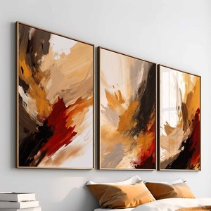
Abstract shapes let burnt orange feel modern instead of seasonal. Look for soft gradients, layered brush textures, or geometric forms that combine burnt orange with cream, tan, or charcoal. If you want a strong focal point, explore burnt orange abstract wall art that uses warm tones as the main story.
Calm minimalism with a single bold accent
Minimalist wall art works especially well in entryways because it keeps the area visually quiet. A simple composition with one burnt orange form or stripe can make the whole space feel curated. For a clean look that still feels warm, browse minimalist canvas wall art in burnt orange tones and pair it with a slim console and a round mirror.
Autumn botanical vibes with leafy forms and floral abstraction
If you want entryway wall decor that hints at autumn without looking themed, choose botanical silhouettes, dried floral shapes, or soft organic lines. Burnt orange works beautifully with muted greens and warm neutrals. A subtle option is warm floral wall art with burnt orange accents that adds movement while staying elegant.
Build a Cohesive Color Palette Around Burnt OrangeThree easy palettes that look intentional
- Cream plus burnt orange plus charcoal for a modern and grounded entry.
- Olive plus burnt orange plus warm white for a soft earthy look.
- Navy plus burnt orange plus brass for a crisp contrast with warmth.
Texture layering that makes wall decor feel premium
Burnt orange looks richer when it is paired with tactile materials. Think woven runners, matte ceramics, and natural wood. Canvas art adds its own texture and helps the color read deeper under changing light. Even a simple entryway can feel designed when you repeat texture in small ways like baskets, a bench cushion, or a linen lamp shade.
Entryway Layout Ideas for Quick Visual Planning
One piece above a console table
This is the easiest layout. Center the artwork above the console, then add a small tray for keys and one vase to echo the color. Keep the surface styling minimal so the wall art stays the hero.
A slim gallery line for long narrow walls
If your hallway wall is long, create a straight line of pieces at consistent height. Keep the frames unified. Use burnt orange as the repeating accent so the gallery reads cohesive rather than random.
Stair landing moment with one vertical canvas
A landing often has a tall blank wall. A vertical canvas art piece in burnt orange tones draws the eye upward and adds warmth to a space that can feel cold or shadowy.
Mirror and art pairing to balance light and color
Mirrors bounce light and can make burnt orange feel brighter. Place a mirror on one side and a canvas on the other, or layer a smaller artwork beside a tall mirror. The key is balance. Keep the shapes and finishes consistent.
Practical Details That Make Wall Art Look Gallery Ready
Hanging and spacing rules you can follow every time
- Start with eye level. Place the center of the artwork near average eye height.
- Above furniture, leave a comfortable gap so it feels connected but not crowded.
- If you hang multiple pieces, keep spacing consistent for a clean rhythm.
- Step back and check alignment from the main approach path to the entry.
- Use warm lighting so burnt orange reads rich rather than flat.
Material notes that matter in real homes
A well made canvas print has crisp detail and stable color. Artesty canvas prints are produced on natural canvas using quality inks, then hand stretched on a thick wooden frame so the artwork arrives ready to display. Multiple sizes make it easier to fit a compact entryway wall or a larger lobby style space with confidence.
Care and placement tips for busy entryways
Keep wall art away from direct moisture and frequent bumps. Dust gently with a soft dry cloth. If the entry is narrow, consider placing the piece slightly higher to reduce contact. Good placement protects the artwork and keeps the wall decor looking clean for the long term.
FAQ
What size wall art works well in an entryway
Choose a size that feels proportional to the wall and any furniture beneath it. If the art sits above a console, aim for artwork that fills most of the width without touching the edges. For tall walls, a larger or vertical piece often looks more balanced.
Can burnt orange wall decor work year round
Yes. Burnt orange can read seasonal when paired with obvious autumn items, but it can also feel modern and earthy all year when paired with neutrals, wood tones, and simple styling.
What colors pair best with burnt orange canvas art
Warm whites, beige, camel, charcoal, olive, and navy are strong partners. Choose one dominant neutral and one supporting accent so the wall art stays the focal point.
How do I choose between one large piece and a gallery layout
One large piece is simpler and often looks more polished in a small entry. A gallery line works well on long walls when you can keep spacing consistent and the palette unified.
Should entryway wall art match the living room
It should relate, not copy. Use one shared element such as a repeated color, a similar frame finish, or a compatible style so the home feels cohesive as you move from room to room.
Is canvas art a good choice for an entryway wall
Canvas adds texture and depth and tends to feel warm and substantial. That makes it a strong choice for entryways where you want impact without clutter.
Where should I place wall art in a narrow hallway
Center the artwork along the main sight line and keep it slightly higher if the corridor is tight. A longer panoramic piece can also help visually stretch the wall.
How can I make burnt orange look modern
Use clean shapes, abstract compositions, and restrained styling. Pair burnt orange with charcoal or black accents and keep the rest of the decor minimal.
How can I make burnt orange look softer and more classic
Choose terracotta leaning tones, add warm neutrals, and use natural textures like wood and woven fibers. Botanical shapes also soften the look.
What frame finish works with burnt orange art prints
Matte black frames give a crisp contrast. Light oak feels airy and relaxed. Walnut adds depth and warmth. Choose a finish that matches nearby hardware or furniture legs.
How high should I hang art above a console table
Leave a comfortable visual gap so the art and furniture feel connected. If it feels like the art is floating too high, lower it slightly and recheck from the entry path.
Can I mix burnt orange wall art with patterned rugs
Yes, but keep the pattern palette controlled. Pull one small tone from the rug that echoes the wall art so the pairing feels planned rather than accidental.
What if my entryway has very little natural light
Burnt orange can brighten a dim space, especially with warm bulbs nearby. Use a simple lamp or wall light to add glow and reduce shadows.
How do I style wall hangings in a small entry without clutter
Use one statement piece and keep the console surface minimal. Choose one small object that repeats the color and one practical item like a tray for keys.
What artwork style feels safest for resale friendly decor
Abstract modern art and minimalist compositions tend to feel widely appealing. Burnt orange can be used as an accent within these styles so it feels tasteful and timeless.
Wrap Up: Choose a Burnt Orange Piece That Sets the Mood
Burnt orange wall art brings instant warmth to an entryway and helps the home feel welcoming from the first step inside. Focus on scale, keep the palette balanced, and use texture to make the color look rich. When you choose a piece that fits the wall and the light, entryway wall decor can feel calm, modern, and distinctly autumn inspired without becoming seasonal only.